skip to main |
skip to sidebar
* note * Comissions are now closed.
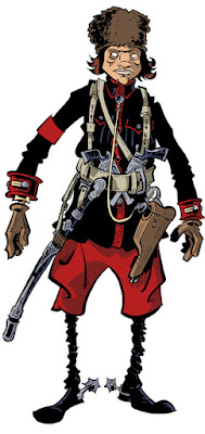
This is a guy I drew 90% of a few months ago, but never finished, so he didn't make it into the sketchbook. I finished him this morning, and colored him while my students were taking a school survey, and here he is. He was a study for one of a trio of expatriate White Russian mercenaries who have since been edited out of the story for Crogan's Escape. That armband would display a Warlord's emblem, but I haven't designed it yet.
Sculpted one of the Crogan brothers from Crogan's Loyalty as a demo in maquette-building for one of my character design classes. Teaching the students how to build maquettes is not something on which an inordinate amount of time should be spent; it's helpful to wrap one's head about the three dimensionality of a design, and representational sculpting will DEFINITELY improve your drawing, just by making you address how one part influences another. But I've known a few people who have fallen into the cyclical pit of feeling like they need to make a maquette for every character that they do, and never get any pages done. So what's even the point? We're not maquettists, guys, we're storytellers.
I spend a LOT of time on preproduction, but it's a means to an end. Never, ever, ever let it be the end. It's self-indulgent, and benefits you nothing. ALWAYS make sure your concept work is leading to stories. Otherwise you're just playing with yourself.
This week's Silhouette Sundays piece is a few of the characters from H. Rider Haggard's King Solomon's Mines, which I've mentioned is a project I'd like to adapt.
From left to right: Umbopa, Captain Good (bottom), Allan Quatermain (top), Sir Henry Curtis, and Twalla
Also, I was the guest columnist for Comic Book Recourses/Robot 6's "What Are You Reading?" feature this week.
The sketchbook files are all finally done! I have to put them in order with the proper amount of space for spine allowances, but hey, the hard part's finished! It goes to press on Wednesday, I think.
My colleague and all-around amazing artist Nolan Woodard colored the covers, and got 'em back to me, despite the fact that I just gave him the files and he's in the middle of a move into a new house with his pregnant wife. He's a great colorist - works regularly for Boom, does stuff for Marvel... he's also a great comic artist, doing Star Wars cards for Topps as well as commissions when time allows. Check him out!
Here's the front:
and here's the back: Click images for full-sized versions
I'll be making the book for sale through Amazon and, hopefully, Diamond. Some details: 184 page softcover, $19.95, 8.5"x11."
Now, here's a special deal for any paid Crogan Adventure Society agents (limited to those who purchased their membership before April of 2011): If you are going to HeroesCon, you can pick up the book from me directly. Show me your membership card, and you get the book for FIVE DOLLARS. That's a seventy-five percent discount. See? I told you there'd be perks! If you're an agent but can't make it to Heroes, I'll be sending out copies around the same weekend, also signed, for TEN DOLLARS. You'll pay no shipping (that's where the price discrepancy comes in) if you live in the states; international may require additional shipping. I hope you'll consider the discount a thanks for supporting the Crogan Adventures through your membership.
For everyone else, the book will be available at the regular $19.95 price - around the price you'll pay for most sketchbooks, but much, much longer than the average, I'd reckon. Maybe not as good, but bigger.
More details to come. I should've gone to bed three hours ago. Maybe I'll pull an all-nighter. Woof.
Just to make sure I keep up with posting, I thought I'd start a new thing - Silhouette Sundays (it was gonna be Saturdays, but I forgot yesterday). Each Sunday I'll post some silhouettes of how I'd tackle various characters. Most will probably come from books, but who knows?
This week: Jack Aubrey and Stephen Maturin from Patrick O'Brian's naval series. I only just read the first of these books (there are 20, 21 if you include the unfinished final tome), and have started the second. They're just as good as everyone says. I made sure to give Stephen clunky, lead-lined boots.
In response to Marvel's announcement that they'd be changing Black Panther to "American Panther," a bunch of my students did their versions of various heroes and villains, replacing a color in their name with "American." I did Black Bolt (pictured above) as American Bolt. Note the Kirby dots replaced with stars, USA! USA!
Anyway, check out the whole collection - there are like twenty, and it'll give you a peak at some students who are going to blow your mind in the next few years.
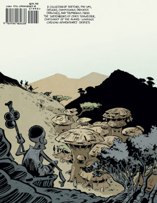
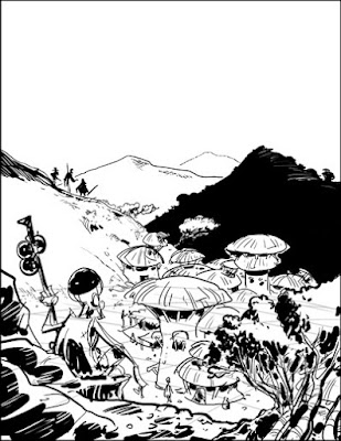
I did the pencils, digitally, for the back cover illustration for the sketchbook. Though not a scene from it, it incorporates some design elements for a kind of adaptation/reinterpretation I've been working on for H. Rider Haggard's King Solomon's Mines.
Click the image for a full-sized version
I still have to letter the vast majority of pages for the sketchbook - I'm doing the text by hand - and juggling it, my school prep, teaching, and getting enough time with Liz and Penny has been a trudging process. Liz is going to visit my sister for a couple of days, though, so I'm gonna buckle down, work round the clock (when I'm not teaching, and I've already done next week's prep in advance), and see if I can knock most of it out. I have to have the files off to the printer by April 17th in order to make sure I have the book well in time for HeroesCon.
I tried to start lettering the sketchbook today, but I kept nodding off again and again at the drawing board - a rare unpleasant side effect of having a little one (specifically, one who desires company in the wee hours... though in fairness offering such company is heartwarming enterprise).
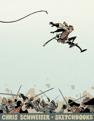
I did get my cover illustration inked, however. It took a few passes, as I kept tossing out attempts. I thank everyone who suggested the thumbnail for this one, but it was not an easy drawing. I may have been harder on it for the weight it has to carry, but I'm pleased enough in the end.
Click the image for a full-sized version
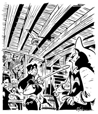
Today, I've got a drawing I did of one of my very favorite comics - Belladone, a french book drawn by former Disney animator Pierre Alary. It's an adventure story set in France in 1680, and is full of some of the best comic art I've ever seen. Alary does what I'd like to do with my art, but much, much better.
Click the image for a full-sized version
I so love Alary's approach to the swashbuckling subject matter and the masterful way that he conveys both movement in his characters and sense of place with his environments that I have twice committed against him the cardinal sin of comic art: swiping.
Now, neither instance is a direct copy, but in both I took directly from him, which I have not done elsewhere and which still makes me feel a little sick to my stomach. Each artist conveys visual information in his or her own unique way, and in these instances mine were not unique. They were variations on what Alary had already done.
The first such instance is from Crogan's Vengeance. I wanted to show after the fact that Catfoot had dived from the ship into the water, and Alary had conveyed this with such clarity that I simply incorporated the same technique. I did not look at his panel when doing this, but had it clearly in mind. His use of air escaping from Marie's mouth or nose in the form of bubbles is a beautiful stroke, and one I didn't think to incorporate.
The second is from Crogan's March. In Alary's Sinbad book, he handles the metal inlay of designs atop the domed roofs of Islamic architecture in a very specific and very aesthetically appealing way. He employs shadow, texture, and weathering on the earthen buildings, and leaves the designs atop them free of such effects. This gives it a noticeably different texture, inferring metal. On the stonework itself he uses the occasional white line to infer scratches and weathering on top of shadow.
I consciously employed both of these methods on my foreground buildings in an establishing shot of Tazifet in March, again, not looking at the original but keeping those principles in mind. Had I looked at the original, I'd have seen how similar in design my tower is to his, and how the angle of the shots is far too similar. Were I to have another go at it, I would very my composition considerably so as to better distance it from its inspiration.
The tower I used as the model for mine, and the model for the design of the cupola.
My choice to avoid looking at the panels so consciously influencing my own was well-meant, but foolish. An idea of the panels I was using as "inspiration" was clearly fixed in my mind, making it unlikely that I would stray far from them in my own compositions, and resulting in not one but two art swipes. As I try to do service to the medium by always striving to do my best, I feel especially rotten about this, and hope that my readers, and Alary's, will forgive me such blatant transgressions.
I use this as an object lesson for any future such intentions - should one of Monsieur Alary's wonderfully executed panels again tempt me with its perfection to try and employ a similar thought process, I'll do my best to abstain, and, should my resolve fail me, I'll at least look at it the next time around to ensure a striking difference.
It's NPR pledge time again, which leads me to posting the first of many pages that have been excised from the upcoming sketchbook because of space.
Presenting: This American Life Contributors Explore the Arctic
(Click the image for a full-sized version)
A while back, while my students were working on the sketchbook-theme assignment for my mini-comics class, I toyed with the idea of doing a theme one myself. Though I'm in a position where I can now financially contribute, for years I had no such extra dough, and would do my bit to support NPR through answering phones during the pledge drives. I still like this idea of service, putting in time for something you feel strongly about, and no program on NPR carries more weight with me than This American Life, a show that basically compiles a series of excellent essays, reports, and memoirs about the theme of the week. There are hundreds of episodes at this point, and I listen to them while working on my books (the penciling and inking stages, not the writing or thumbnails).
My idea was that I'd do a This American Life-themed mini, something with nice production values and a screen-printed cover, featuring funny illustrations of a dozen or so of TAL's more prominent contributors, sell 'em at shows, and give 100% of the proceeds to the program, hopefully putting more money into it than I usually do on my own. I did a few preliminary sketches of some of the folks with whose visages I'm somewhat familiar... and had to stop. Radio, it seems, doesn't do the best job of helping one remember faces, and maybe I'm lousy at internet searches but I had a devil of a time trying to find photos of the folks for whom I was looking. If anyone can point me in the right direction (and not the show's staff page - many of those are candids from a distance, and of little use for reference), I may take it up again. Who knows, I might do a print instead of a mini. Either way, it's my little fan attempt to show how much the show means to me. That, and a chance to draw Sarah Koenig punching a walrus in the face.
You can support This American Life here.
Also, I'll post a report of my trip to the OSU Cartoon Research Library in a day or two, so check back!
Well! The sketchbook is now completely laid out - with the exception of two drawings that have yet to be inked - so I'll begin annotations after I get home. I hope to have it off to press within a week of the new school quarter starting.
In the meantime, here's a drawing (finally inked!) that will be going in.
It's pulp hero Doc Savage and his intrepid band of adventurers.
I've been invited to be a guest at Dragon*Con this year. I've never been to Dragon Con, even though it's an Atlanta show and I've lived here for, what, half a decade? So, yay!
Here's a drawing to celebrate.
I'm actually doing a lot of shows and signings in the near future. I've finally updated my appearances page, if you're interested:
First off, here's a picture that I penciled forever ago but finally inked. I did it with the idea of approaching it like an old pulp illustration, taking up part of the page but using sections of the negative space to allow for text placement. Anyway, the Shadow!
(Click the above image for a full-sized version)
I'm inking quite a few unfinished drawings for the sketchbook. I have 170 of the 184 pages laid out - and I still have a lot that I want in there, so I'm gonna have to do some trimming soon. Maybe shrink down some of the pin-ups to have more than one per page, or eliminate some of the not-as-good-as-others sketchbook scans.
In appearances-related news, I'll be in Ohio in a couple of weeks, talking at Northern Kentucky University (which is technically KY but minutes from Cincinnati), visiting the Cartoon Library at OSU, and doing a SIGNING IN COLUMBUS AT THE LAUGHING OGRE ON FRIDAY MARCH 18 FROM 4 to 8. If you're in Columbus, come by! Just a reminder, Adventure Society members get something free! Don't know what yet, but something. Also, the Small Press and Comics Expo is that Saturday, so I'll drop by there for a bit on Saturday before taking off for home.
I'll be announcing other appearances later this week - just have to check with one first and make sure it's public.
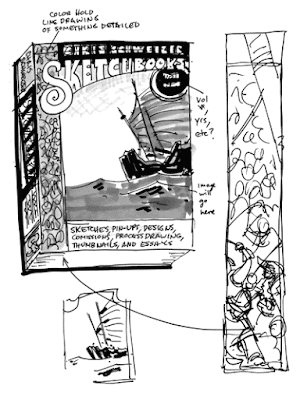
My apologies, followers of this blog, for being so conspicuously absent for the last month. I've been using what time I have to lay out the sketchbook I mentioned in the last post. It is coming along well, and I've got more than three quarters of it laid out, though none of the annotations have been written yet. As I haven't had a chance to do many sketches lately, I thought I'd instead post my thumbnails for the cover of the sketchbook.
After a lot of sketches, this is where I ended up... at first. I wanted a simple, striking image, so I was going to use this Chinese junk, but I also wanted to show off that there will be intricate drawings inside, so the pattern on the side would actually be a battle scene. It would list everything that I'd have inside, etc. And after reading this wonderful interview with First Second's super-duper amazing book designer Colleen AF Venable, I got excited about showing her what I had and getting her feedback on it when I was in New York.
As I opened my sketchbook, though, I knew already what her thoughts on it would be. It's terrible from a design standpoint, in that it tries to show off too much and ends up being a mess. She had earlier mentioned that this is a problem some artists have, making their covers too busy. I've always griped about it, but I definitely understand it! The idea of letting a simple but strong image be the sole thing grabbing a potential buyer/reader's attention is scary.
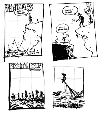
Colleen suggested doing a LOT of thumbnails. Thirty plus. And I'm glad she did! I've been doing a whole bunch, and have found a few that I like. Here are those few!
Regarding that simplicity thing, I'm terrified of using just silhouettes for the baggage handlers in the bottom left corner one above, even though I know that would be the best way to approach it. 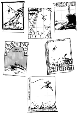 I'm most leaning towards the bottom right two here. One is a war elephant throwing a guy into the air, and the other is a swashbuckly guy sailing over a battle scene.
In all of these thumbnails, I'll really paying attention to the rule of thirds, which is a principle of composition that says that if you divide an image into three parts, both vertically and horizontally, the viewer's eye will most easily gravitate towards one of the points where those divisions intersect. I usually don't pay as much attention to this, allowing my compositions to be more organic (besides, it's more or less ingrained in me by this point), but I wanted to approach these cover designs very methodically.
So no one be upset if I don't pick the one you like, but I am curious - which cover stands out most to you as a good one? My inclination right now is probably the swashbuckly guy, but there are still three or four other contenders in my mind.
|