

Tuesday, November 22, 2011
Too Many Trees
20-Minute Color Sketches: Robocop

Saturday, November 19, 2011
20-Minute Color Sketches: Some Old Cowboy

Speaking of old cowboys, I watched the second episode of AMC’s “Hell on Wheels.” The first episode was truly awful, but the second one was not too bad. I’ll give it four episodes, I think - if it continues to improve, I’ll likely keep watching. I’m a sucker for Westerns.
Friday, November 18, 2011
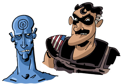
20-Minute Color Sketches: Watchmen
Thursday, November 17, 2011
20-Minute Color Sketches: He-Man
Today's sketch: The Master of the Universe...

Wednesday, November 16, 2011
20-Minute Color Sketches: Wolverine vs Sabretooth
When I was a kid, I had Marvel trading cards and some of 'em depicted "famous battles." This is like that, only quicker.

Tuesday, November 15, 2011
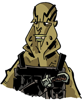
20-Minute Color Sketches: Abe Sapien
Here's another of those quick sketches. Drawing and coloring both, I'm putting a cap at twenty minutes max for these. That'll ensure that I can produce at least one a day without infringing on my CROGAN ADVENTURES work. So know that you can check in every morning (barring the ones where I'm out of town at cons and the like) and there will be a new drawing up, like this one, ABE SAPIEN:
Monday, November 14, 2011
MAD, MAD, SCAD Weekend
I went to Savannah, Georgia for our National Cartoonist Society meeting this month. It was quite the big to-do, as it served as a big reunion for pretty much all of the original MAD MAGAZINE guys - Al Jaffee, Jack Davis, Paul Coker, Nick Meglin, and Sam Viviano - plus current MAD caricature guy and NCS president Tom Richmond, in addition to all the great Southeast chapter folk and the ones who flew in for the shindig. It was great seeing some of these old dogs again, and even greater meeting the folks who I hadn't yet had occasion to.
I did a couple of sketches during a workshop that Sergio did, and figured I'd post 'em up.

Friday, November 11, 2011
Gambit and Rogue
Another colored sketchbook sketch - Gambit and Rogue, from the X-Men. Given Rogue's hair, Alabama upbringing, and general all-around 80sness I thought she should look like she stepped in Spandex out of Steel Magnolias, so she's halfway between Julia Roberts and Dolly Parton.

Thursday, November 10, 2011
Justice League, HO!
While most of my comic work is done with a brush (and most of the stuff I post up here, for that matter), I generally sketch with fixed-line pens. I even do my "pencils" with them. It's much more intuitive and quick for me to work that way, but I've always been hesitant to try it with actual pages. But you know what? The brushy stuff automatically gives my stuff a cartoonier look, atop already cartoony designs. I love it for the Crogan books, and will continue to use it there, but I'm thinking about trying to use this for other stuff, which I feel might be a little more "mainstream friendly." I don't know, maybe I'm crazy. So I figured I'd color one of my classroom sketches from today, these justice league guys:

Wednesday, November 2, 2011

Wednesday, October 26, 2011
The Schweizer Guide to Spotting Tangents
Comic art is, as a general rule, a line-based medium. I know, I know, there are plenty of artists whose work is painted, or who depict their subject in ink using solely light and shadow. But these folks are unquestioningly in the minority, as the history of printing technology originally dictated the use of line to depict form in the early days of comics. This became a stylistic expectation, and it’s an expectation that I enthusiastically embrace, as have many others. But using line to draw the world invites chances for that cardinal sin of composition: the tangent. A tangent is when two or more lines interact in a way that insinuates a relationship between them that the artist did not intend. It can create confusion on the part of the audience as to what it is that they’re looking at. It can cause the spatial depth that one attempts to cultivate through the use of planes to become flattened. Most of all, it creates a decidedly unwelcome aesthetic response: tangents are just plain ugly. There are a lot of different types of tangents, as least according to the way I define them. In order to make it easier on my students when giving critiques, I’ve categorized them and named them. This may have been done before, but I’ve not encountered it. My hope is that, by making this “spot-the-enemy” guide, fewer artists will fall into the tangent trap by knowing what to look for.
1. The Long Line
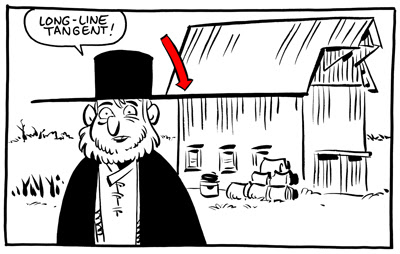 The long line is when a line from one object runs directly into the line of another. This is the tangent that everybody knows. The one that’s easiest to spot, easiest to avoid. For a lot of folks, this is the only thing meant when one refers to a “tangent.” Even in the work of the very best comic artists, a vigilant eye can find the occasional tangent. Even when a cartoonist is constantly on the lookout, a tangent can slip through. But, as each of strive to better ourselves and the quality of our work and our medium,
2. The Parallel
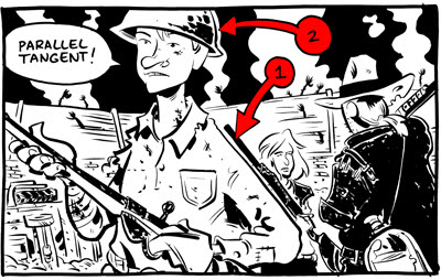 The parallel tangent is when the containing lines of two objects run alongside each other. This causes one of two negative outcomes. Either one object becomes “lost,” as the other overpowers it (figure 1), or one object feels strangely contained by another (figure 2).
This can be avoided by ensuring that any object that COULD run alongside another is angled at least 45 degrees from the first.
The next two are REALLY tough to spot, and most artists have fallen victim to them before.
The parallel tangent is when the containing lines of two objects run alongside each other. This causes one of two negative outcomes. Either one object becomes “lost,” as the other overpowers it (figure 1), or one object feels strangely contained by another (figure 2).
This can be avoided by ensuring that any object that COULD run alongside another is angled at least 45 degrees from the first.
The next two are REALLY tough to spot, and most artists have fallen victim to them before.
3. The Corner
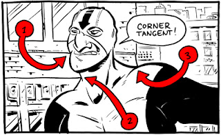 The corner tangent is when two lines in an object meet in a way intended by the artist, but another (accidental) line runs directly into the place where they meet.
4. The Bump-Up
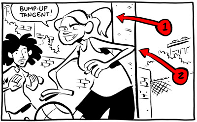
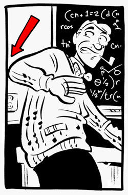
5. The Directional
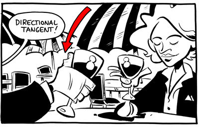 A directional tangent is basically just a long-line tangent that’s been broken by empty space. Now, this one isn’t always bad – it can, on occasion, be used to draw the reader’s eye through the image on a specifically determined path.
6. The Panel-to-Panel
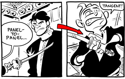 This one is exactly the same thing as the directional (in fact, I shouldn’t even classify it as its own thing), save that instead of empty space dividing a long-line it’s a panel gutter.
My gutters are crazy wide, but with normal-sized gutters this can be a real problem.
One more thing…
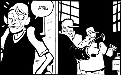
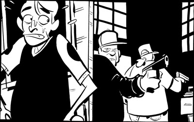
This ain’t a tangent, but it is a compositional no-no.
This one is exactly the same thing as the directional (in fact, I shouldn’t even classify it as its own thing), save that instead of empty space dividing a long-line it’s a panel gutter.
My gutters are crazy wide, but with normal-sized gutters this can be a real problem.
One more thing…
This ain’t a tangent, but it is a compositional no-no.
Fake Panels
Sunday, October 23, 2011
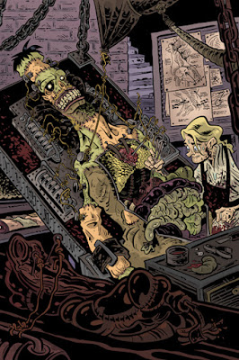
Frankenstein!
Halloween is rapidly approaching. And man, I love Halloween. I love it so much that I was going to do thirteen spooky drawings and post them all this month. But then I remembered that I've got to finish the next Crogan Adventures book, so you're only getting two: the Dracula I did on Friday, and Frankenstein.
Thursday, October 20, 2011
Dracula!
Halloween's approaching! So I'm gonna do a couple Halloweeny drawings over the next few days. Here's the first one:

Subscribe to:
Posts (Atom)