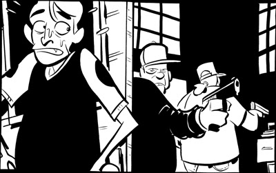
Comic art is, as a general rule, a line-based medium. I know, I know, there are plenty of artists whose work is painted, or who depict their subject in ink using solely light and shadow. But these folks are unquestioningly in the minority, as the history of printing technology originally dictated the use of line to depict form in the early days of comics. This became a stylistic expectation, and it’s an expectation that I enthusiastically embrace, as have many others. But using line to draw the world invites chances for that cardinal sin of composition: the tangent. A tangent is when two or more lines interact in a way that insinuates a relationship between them that the artist did not intend. It can create confusion on the part of the audience as to what it is that they’re looking at. It can cause the spatial depth that one attempts to cultivate through the use of planes to become flattened. Most of all, it creates a decidedly unwelcome aesthetic response: tangents are just plain ugly. There are a lot of different types of tangents, as least according to the way I define them. In order to make it easier on my students when giving critiques, I’ve categorized them and named them. This may have been done before, but I’ve not encountered it. My hope is that, by making this “spot-the-enemy” guide, fewer artists will fall into the tangent trap by knowing what to look for.
Wednesday, October 26, 2011
The Schweizer Guide to Spotting Tangents
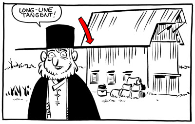
1. The Long Line
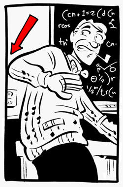
The long line is when a line from one object runs directly into the line of another. This is the tangent that everybody knows. The one that’s easiest to spot, easiest to avoid. For a lot of folks, this is the only thing meant when one refers to a “tangent.” Even in the work of the very best comic artists, a vigilant eye can find the occasional tangent. Even when a cartoonist is constantly on the lookout, a tangent can slip through. But, as each of strive to better ourselves and the quality of our work and our medium,
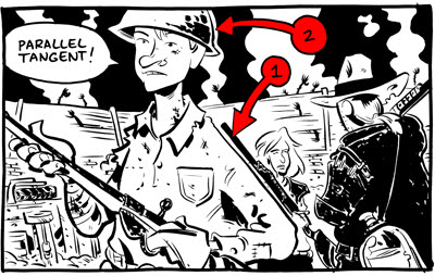
2. The Parallel
The parallel tangent is when the containing lines of two objects run alongside each other. This causes one of two negative outcomes. Either one object becomes “lost,” as the other overpowers it (figure 1), or one object feels strangely contained by another (figure 2).
This can be avoided by ensuring that any object that COULD run alongside another is angled at least 45 degrees from the first.
The next two are REALLY tough to spot, and most artists have fallen victim to them before.
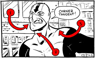
3. The Corner
The corner tangent is when two lines in an object meet in a way intended by the artist, but another (accidental) line runs directly into the place where they meet.
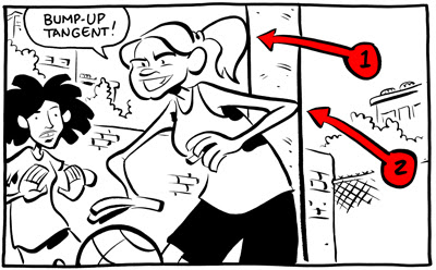
4. The Bump-Up
A bump-up tangent is when the containing line of one object “bumps up” against the containing line of another object. When these two lines touch, it creates a bump-up tangent (and even when they don’t technically touch, if it’s close enough to raise eyebrows, they might as well).
The bump-up gives the impression of containment. In figure 1, it seems as though her ponytail is physically unable to enter the space occupied by the pole. In figure 2, it feels as though her elbow is unable to LEAVE that space.
Also, be careful not to let elements of the drawing bump up against your panel borders! Either give them room to breathe or decisively crop them.
5. The Directional
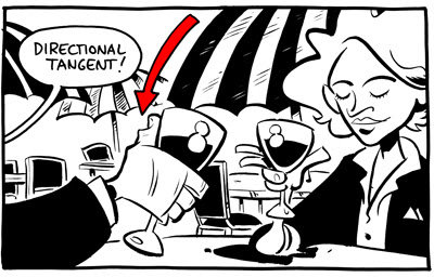
A directional tangent is basically just a long-line tangent that’s been broken by empty space. Now, this one isn’t always bad – it can, on occasion, be used to draw the reader’s eye through the image on a specifically determined path.
6. The Panel-to-Panel
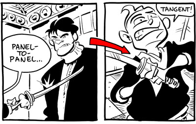
This one is exactly the same thing as the directional (in fact, I shouldn’t even classify it as its own thing), save that instead of empty space dividing a long-line it’s a panel gutter.
My gutters are crazy wide, but with normal-sized gutters this can be a real problem.
One more thing…
This ain’t a tangent, but it is a compositional no-no.
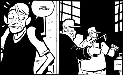
Fake Panels
Comics generally have panel borders, so readers are used to having images contained by straight lines. Some artists don’t allow gutters between their borders. Though I believe that, as a rule, this can make it harder for new comics readers to follow the story (and new readers are always important), it’s done with enough regularity that we must expect the audience to feel comfortable with gutterless pages.
What does this mean? It means that we can’t draw a straight line in any panel, either vertical or horizontal, without having some object overlap it. If we do, readers may think that it is a panel border, incorrectly breaking one moment into two.
See how the overlap of the elbow causes there to be no question?
That's it for Lesson #1. Lesson #2 will come around in the next few days. Feel free to use any terminology that I've laid down in this one, or feel free to abandon it in favor of better, more accurate terminology.
Posted by Chris Schweizer at 6:39 PM 16 comments
Sunday, October 23, 2011
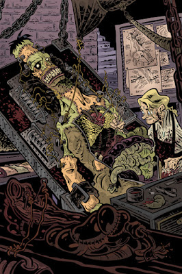
Frankenstein!
Halloween is rapidly approaching. And man, I love Halloween. I love it so much that I was going to do thirteen spooky drawings and post them all this month. But then I remembered that I've got to finish the next Crogan Adventures book, so you're only getting two: the Dracula I did on Friday, and Frankenstein.
click the image for a full-sized version I was Victor Frankenstein in a play once. This was in college. College for me consisted of studying, dating, and loads of humanties-related extracurricular activities, which meant I often had days at a time where I slept two or three hours a night. During Frankenstein I was in one of these no-sleep cycles, and was nearly dead on my feet. During one performance, I tried to bypass this little roadblock by taking three no-doz tablets (caffeine pills), in addition to the coffee that I was pretty much breathing. Then I forgot that I'd taken the no-doz and took three more. I got a pretty heavy case of the shakes about halfway through the show, and was sweating a lot. My eyes were full-blown twitchy. On the positive side, this was around the scene where my passion and obsession over finishing the monster were at their peak, and I was alienating my friends and loved ones with frantic, single-minded nuttiness, so the shakes/sweats merely served to bolster my performance. The negative is that I spent intermission throwing up behind the theater. Happy Halloween! Oh, and the original drawing for this piece IS for sale (you can see the uncolored scan on the original art sale page). It's $200 (that includes shipping). It's one of the most detailed things I've ever drawn, and we need a leaf-blower.Posted by Chris Schweizer at 12:11 PM 2 comments
Thursday, October 20, 2011
Dracula!
Halloween's approaching! So I'm gonna do a couple Halloweeny drawings over the next few days. Here's the first one:
(click for the full-sized drawing)Posted by Chris Schweizer at 11:24 PM 1 comments
Subscribe to:
Comments (Atom)
