My apologies, followers of this blog, for being so conspicuously absent for the last month. I've been using what time I have to lay out the sketchbook I mentioned in the last post. It is coming along well, and I've got more than three quarters of it laid out, though none of the annotations have been written yet. As I haven't had a chance to do many sketches lately, I thought I'd instead post my thumbnails for the cover of the sketchbook.
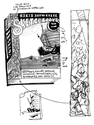
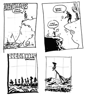
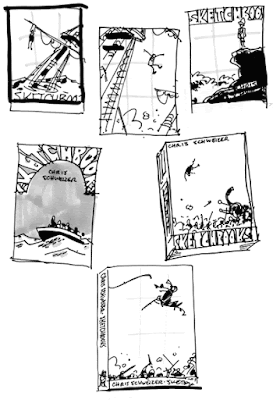
After a lot of sketches, this is where I ended up... at first. I wanted a simple, striking image, so I was going to use this Chinese junk, but I also wanted to show off that there will be intricate drawings inside, so the pattern on the side would actually be a battle scene. It would list everything that I'd have inside, etc. And after reading this wonderful interview with First Second's super-duper amazing book designer Colleen AF Venable, I got excited about showing her what I had and getting her feedback on it when I was in New York. As I opened my sketchbook, though, I knew already what her thoughts on it would be. It's terrible from a design standpoint, in that it tries to show off too much and ends up being a mess. She had earlier mentioned that this is a problem some artists have, making their covers too busy. I've always griped about it, but I definitely understand it! The idea of letting a simple but strong image be the sole thing grabbing a potential buyer/reader's attention is scary. Colleen suggested doing a LOT of thumbnails. Thirty plus. And I'm glad she did! I've been doing a whole bunch, and have found a few that I like. Here are those few! Regarding that simplicity thing, I'm terrified of using just silhouettes for the baggage handlers in the bottom left corner one above, even though I know that would be the best way to approach it. I'm most leaning towards the bottom right two here. One is a war elephant throwing a guy into the air, and the other is a swashbuckly guy sailing over a battle scene. In all of these thumbnails, I'll really paying attention to the rule of thirds, which is a principle of composition that says that if you divide an image into three parts, both vertically and horizontally, the viewer's eye will most easily gravitate towards one of the points where those divisions intersect. I usually don't pay as much attention to this, allowing my compositions to be more organic (besides, it's more or less ingrained in me by this point), but I wanted to approach these cover designs very methodically. So no one be upset if I don't pick the one you like, but I am curious - which cover stands out most to you as a good one? My inclination right now is probably the swashbuckly guy, but there are still three or four other contenders in my mind.Thursday, March 3, 2011
Subscribe to:
Post Comments (Atom)


7 comments:
Cowboys, Elephant, Swashbuckler.
Those are my personal favorites at the moment. Great work as always Chris!
I can't wait to get my hands on this book!
I too like the last one. It's a good choice of moment. Right before he joins the fight. It makes you want to open that cover and see what's inside!
The thumbnails that have a lot of negative space really are the most striking - the swashbuckler, elephant victim, and the gentleman sitting on the sinking ship are the ones that most jump out to me.
Thanks, guys! I appreciate the feedback. So far your thoughts are echoing mine in that the last one might be the best way to go.
I really like the last one, definitely shows off your Pierre Alary inspiration. But I also like the first one in the second batch, with you on a cliff yelling your name. Probably because it showcases your personality so well.
The sinking ship, swinging swashbuckler, war elephant,
I like the last two thumbnails, but of them I prefer the war elephant, mainly because of the humor in it haha
But really, my favorite of all the thumbnails is the cutter. Not sure exactly why, but it looks like it could be a really heroic moment :)
I like the Sinking Ship,
The Swashbuckler, and the Elephant. In that order. The reason I lean more toward the sinking ship is the element of humor. I can look at a sketchbook and enjoy it purely because of the art, but the idea that there will be a chuckle now and again goes a long way for me.
Post a Comment