header

Tuesday, December 21, 2010

Community Avengers

I got a commission to draw the cast of Community, easily my favorite show on TV. I decided to draw them as the Avengers.


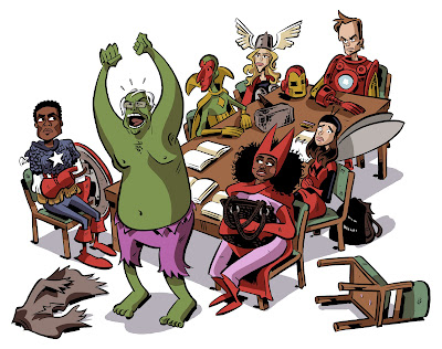
 (Click on the above image for a full-sized version) For folks who watch the show, here’s a Christmas present for you: I went ahead and sized it for wallpapers, should you be inclined to use ‘em.  I'm not tech-savvy enough to know how to make 'em download straight away, so just click on the one that fits your screen size and drag the image to your desktop (if you're on a Mac) or save it, I think (if you're on a PC). • 1600 x 12001280 x 12441280 x 9601152 x 8641024 x 768800 x 600640 x 480 For folks who don’t watch Community, start! I promise you, you are missing out on one of the best group dynamics of any sitcom, ever. I could go on and on about how great the show is, but I won’t, ‘cause it would be boring. I’m taking a few days off posting to the blog for the next few days. Merry Christmas, everyone!

Sunday, December 19, 2010

Twitter

I have a twitter now: http://twitter.com/#!/schweizercomics/

I guess follow me to get the play-by-play.

Thursday, December 16, 2010

Pencils

For my pencils (underdrawing), I use a black Col-Erase pencil to put down extremely loose lines, giving me a sense of my composition, and sometimes (as is the case here) a grid of sorts for the ground plane.  I tighten it up just a little bit, and then I go over those pencils with Faber Castell PITT pens, using all of the sizes but mostly XS. 


I wanted to scan this one before I erase the pencil marks, which I do so that when I scan this to blow it up and print it out in light blue it'll be easier to decipher my own intent for the inks, especially since I'll be laying them down much later.  I wanted to save this one, though, because I did far more with the pencil than I usually do at this stage. Back to work!  I want to see if I can finish this, the third page for today.

Tuesday, December 7, 2010

China Sailor

Here's a guy I drew a few days ago - a costume study for a US shore patrol sailor in 1920s China.


Click the image for a full-sized version. When I was a really little kid, out next door neighbor had old Navy tattoos that had turned blue-green with age, so I always like to throw that color down when I can.  A big reason why I don't have any tattoos myself is that now they're "better" and won't age in such a way, which to me is like buying leather that won't scuff and shine.  What's the point?

Friday, December 3, 2010

Book Cover for my Dad's New Novel

My dad's got a great mystery novel series (the St. Germaine books), but has written a new book that's less a cozy and more of a hard-boiled.  It's set in 1940s Chicago, with a cop who had been a pro footballer back in the days of leather helmets.  I enjoyed the heck out of the first draft (I haven't read the final version yet), and asked if I might take a crack at designing the cover.  He said sure. Here was my mock up - I sent him a bunch of different color versions, and this is the one he liked best:


He ran it by his book folks, who cautioned him that it looked a little too much like a graphic novel, so I eliminated the line-work on the final version and made it more of a collage-y type of deal. Anyway, here's the front cover:

 Here's the wraparound, though it doesn't yet have publisher logo/ISBN/text yet.

Anyway, it was fun!  He's been very patient, too - I told him I'd do this back in the summer, but pressing deadlines have prevented me from doing so.  Anyway, not sure when it's coming out, but keep your eyes peeled - I think it's soon. I might eliminate the shadow on the big guys gun arm, and just have it be all light orange, save the gun itself.  Thoughts?