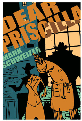
My dad's got a great mystery novel series (the St. Germaine books), but has written a new book that's less a cozy and more of a hard-boiled. It's set in 1940s Chicago, with a cop who had been a pro footballer back in the days of leather helmets. I enjoyed the heck out of the first draft (I haven't read the final version yet), and asked if I might take a crack at designing the cover. He said sure. Here was my mock up - I sent him a bunch of different color versions, and this is the one he liked best:
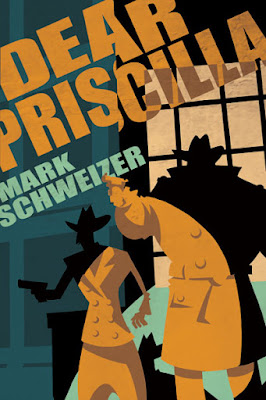
He ran it by his book folks, who cautioned him that it looked a little too much like a graphic novel, so I eliminated the line-work on the final version and made it more of a collage-y type of deal. Anyway, here's the front cover:
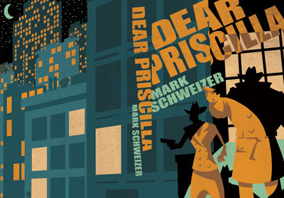
Here's the wraparound, though it doesn't yet have publisher logo/ISBN/text yet.
Anyway, it was fun! He's been very patient, too - I told him I'd do this back in the summer, but pressing deadlines have prevented me from doing so. Anyway, not sure when it's coming out, but keep your eyes peeled - I think it's soon. I might eliminate the shadow on the big guys gun arm, and just have it be all light orange, save the gun itself. Thoughts?


4 comments:
First off, the typography and the color palette are amazing on this, especially the type on the spine.
I really like the figures the way they are, but if you wanted to get rid of some of the shading, maybe keep the big curve under the arm, but reduce the shadow (the two points) going up the side of his arm? That might strengthen the silhouette as one mass of orange (and I wonder if the spotlight might hit some of those areas a bit stronger anyway?).
Anyway, if it were me, I wouldn't change a thing, but if it were me, I wouldn't have been able to design this well in the first place.
Thanks, Eric. I agree with you on the arm thing, and will fix it. There are a few things here and there that I'm noticing, which just goes to show why finishing things before 11:58 on deadline day is a good idea, though one that I'm not intimately familiar with.
It's an awesome cover.
I love this cover! It would definitely grab my attention from a bookshelf. Also drawing my attention would be the title--as a Priscilla, I love encountering instances of my name in fiction. Often, they tend to be a dislikeable lot, which delights me to no end. I look forward to the book's release!
Post a Comment