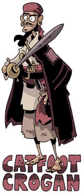
I've been posting these labeled drawings of my interpretations of other people's characters for like two months straight, and I thought, "You know what? Maybe I should post my own!" So here's the first of a bunch of figures from Crogan's Vengeance: the book's protagonist, "Catfoot" Crogan.
As with the Sherlock Holmes figures (sets of which I'll begin selling on Monday), I plan to make these into sets of paper figures. I may make them available as papercraft downloads that you print yourself, but the downside with that is that these colors are too similar to each other to have good definition when printed on an inkjet, I may print them up professionally and have them available at shows and for sale online. I'd love feedback on that from whoever has a strong opinion. The other question I have is one which I hesitate to ask, for fear that if I end up deciding to go in a direction other than what someone suggests I'll end up alienating that reader, whereas if I just did it and gave no options then no one could be bugged. Ah, but I'm on the fence. Here's the question: If I were to make these Crogan paper figures available, would you all want them with the names serving as a stand at the bottom, as is currently the case, or would you want them absent this text? I feel like the text does a good job of giving them all a similar element that ties them all together, but I don't really know. Thoughts?Saturday, January 28, 2012
Subscribe to:
Post Comments (Atom)


3 comments:
I like having the names on the bottom. It also has the added benefit of helping me remember the characters names. :) Peace, maka
I'd say keep the names!
Chris,
Definitely names. I like the idea of having them as a place stand. I think, as paper figures they are great with the name at the bottom. If they were more 3D, or made for wall art I'd disagree.
Jay
Post a Comment