Comic art is, as a general rule, a line-based medium. I know, I know, there are plenty of artists whose work is painted, or who depict their subject in ink using solely light and shadow. But these folks are unquestioningly in the minority, as the history of printing technology originally dictated the use of line to depict form in the early days of comics. This became a stylistic expectation, and it’s an expectation that I enthusiastically embrace, as have many others. But using line to draw the world invites chances for that cardinal sin of composition: the tangent. A tangent is when two or more lines interact in a way that insinuates a relationship between them that the artist did not intend. It can create confusion on the part of the audience as to what it is that they’re looking at. It can cause the spatial depth that one attempts to cultivate through the use of planes to become flattened. Most of all, it creates a decidedly unwelcome aesthetic response: tangents are just plain ugly. There are a lot of different types of tangents, as least according to the way I define them. In order to make it easier on my students when giving critiques, I’ve categorized them and named them. This may have been done before, but I’ve not encountered it. My hope is that, by making this “spot-the-enemy” guide, fewer artists will fall into the tangent trap by knowing what to look for.
Wednesday, October 26, 2011
The Schweizer Guide to Spotting Tangents
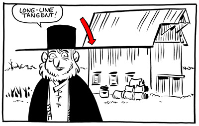
1. The Long Line
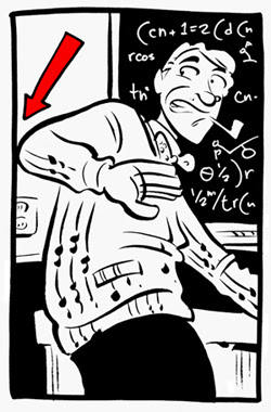
The long line is when a line from one object runs directly into the line of another. This is the tangent that everybody knows. The one that’s easiest to spot, easiest to avoid. For a lot of folks, this is the only thing meant when one refers to a “tangent.” Even in the work of the very best comic artists, a vigilant eye can find the occasional tangent. Even when a cartoonist is constantly on the lookout, a tangent can slip through. But, as each of strive to better ourselves and the quality of our work and our medium,
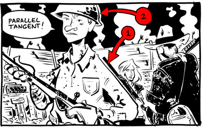
2. The Parallel
The parallel tangent is when the containing lines of two objects run alongside each other. This causes one of two negative outcomes. Either one object becomes “lost,” as the other overpowers it (figure 1), or one object feels strangely contained by another (figure 2).
This can be avoided by ensuring that any object that COULD run alongside another is angled at least 45 degrees from the first.
The next two are REALLY tough to spot, and most artists have fallen victim to them before.
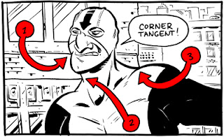
3. The Corner
The corner tangent is when two lines in an object meet in a way intended by the artist, but another (accidental) line runs directly into the place where they meet.
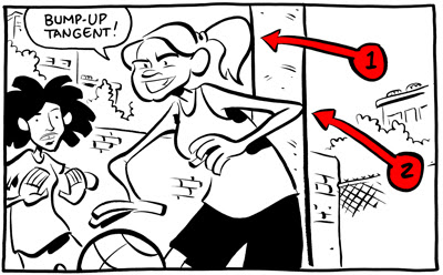
4. The Bump-Up
A bump-up tangent is when the containing line of one object “bumps up” against the containing line of another object. When these two lines touch, it creates a bump-up tangent (and even when they don’t technically touch, if it’s close enough to raise eyebrows, they might as well).
The bump-up gives the impression of containment. In figure 1, it seems as though her ponytail is physically unable to enter the space occupied by the pole. In figure 2, it feels as though her elbow is unable to LEAVE that space.
Also, be careful not to let elements of the drawing bump up against your panel borders! Either give them room to breathe or decisively crop them.
5. The Directional
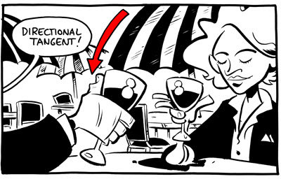
A directional tangent is basically just a long-line tangent that’s been broken by empty space. Now, this one isn’t always bad – it can, on occasion, be used to draw the reader’s eye through the image on a specifically determined path.
6. The Panel-to-Panel
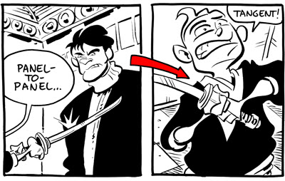
This one is exactly the same thing as the directional (in fact, I shouldn’t even classify it as its own thing), save that instead of empty space dividing a long-line it’s a panel gutter.
My gutters are crazy wide, but with normal-sized gutters this can be a real problem.
One more thing…
This ain’t a tangent, but it is a compositional no-no.
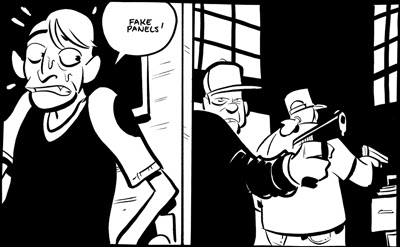
Fake Panels
Comics generally have panel borders, so readers are used to having images contained by straight lines. Some artists don’t allow gutters between their borders. Though I believe that, as a rule, this can make it harder for new comics readers to follow the story (and new readers are always important), it’s done with enough regularity that we must expect the audience to feel comfortable with gutterless pages.
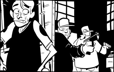
What does this mean? It means that we can’t draw a straight line in any panel, either vertical or horizontal, without having some object overlap it. If we do, readers may think that it is a panel border, incorrectly breaking one moment into two.
See how the overlap of the elbow causes there to be no question?
That's it for Lesson #1. Lesson #2 will come around in the next few days. Feel free to use any terminology that I've laid down in this one, or feel free to abandon it in favor of better, more accurate terminology.
Posted by Chris Schweizer at 6:39 PM
Subscribe to:
Post Comments (Atom)

16 comments:
Nice- very helpful for illustrators as well. Thanks!
Thanks for the great post, Chris! I will be showing these excellent examples in my class next week!!!
Found this through a Tumblr link, and as you've posted it on my birthday, it's one of the best gifts I can get! Important rules of thumb that sometimes slip my mind when careless. Thank you for this :-)
(And of course like anything else I think there are situations when many of these can be appropriate, but unless you've got enough practice under your belt, artful intention will tend to look like a sloppy accident.)
Cheers!
Very helpful! One tangent I have to be *very* attentive to is a bump-up of the top or edge of a speech balloon with a panel border. I concentrate so hard on making a nicely curved balloon that I neglect to note when the edge is skirting a panel border or something else in the drawing.
Yes, Yes! Concise and cogently comprehensive!
I'd love to see more of these.
So that's what these annoying lines are called! This was something I pointed out in a blog post last month. Was this influenced by that?
http://sundaycomicsdebt.blogspot.com/2011/09/comic-pet-peeves.html
DeBt - I hadn't seen your post, but it's spot-on! The double-page spread is something with which I often get flustered, because when it's not done correctly I read the sequence out of order. Great notes!
We talk about something similar in photography/video, with regards to psychological closure, and figure/ground relationships. You see similar effects when people don't pay attention to what is behind a subject in a shot, and you get poles or antlers growing out of heads when someone stands in the wrong spot. Ah, I wish we could sit in on more classes together. We'd have much to talk about!
Thank you for creating such clear illustrations of these tangents! I feel like I'm always reminding my illustration students about them (sometimes I call them 'warp zones'), I'll have to point them in your direction!
That last one depends on whether the artwork is going to appear in colour or not. If the door is coloured differently to the panel borders then the reader won't see it as two panels.
Kali - thanks!
Tom - You're absolutely right. I usually work for black and white, which is why it's always on my mind. Even in color, though, one straight line can give the impression of a false panel if the artist doesn't always use gutters between the panels.
I love this and I am going to use your examples in my class after Christmas.
The "bump-up" is the one that's an actual geometric tangent, and where this phenomenon gets its name.
I took a cartooning class (from Mike Cochran, who you haven't heard of) and was effectively taught to avoid these.
What I hate is when it's a slow-motion wreck, and you've planned out a big drawing, and you get to a point where… oh, hell… the tangent is well-nigh unavoidable. After all that work.
Fortunately, there are drugs.
For a lot of folks, this is the only thing meant when one refers to a “tangent.”
Uh, no, a tangent means a specific relation of a curve and a straight line - specifically #4, your bump-up tangents. If you want to expand it to other things, you might want to pick another name.
This is very helpful!
Post a Comment