skip to main |
skip to sidebar
First, I have an interview with ACME COMICS, a store in North Carolina at which I'm doing a signing in March. Give it a read!
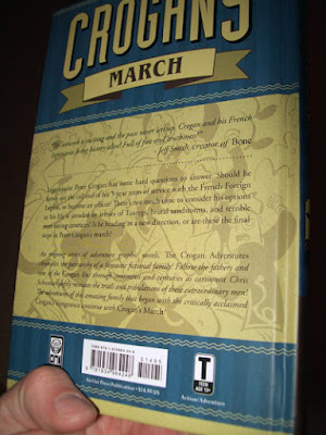
Secondly, the reviews of Crogan's March have been popping up. Give them a read, too!
School Library Journal
Kleefeld on Comics
Newsarama
Graphic Novel Reporter
Innocent Bystander
Geek Girl on the Street
Also, here's a drawing, so that this isn't too boring a post! (click on the picture for a bigger version of the same picture)
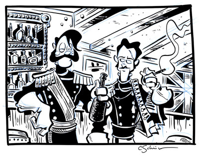
One of the Crogan Adventure Society agents requested a drawing of Matthew Crogan, a character whom I haven't done much sketching with. After finishing his, I was warmed up, and decided to do a drawing of him standing next to Sir Harry Flashman, the main character in George MacDonald Fraser's Flashman Papers series, the reason I'm doing historical fiction in the first place. Since both characters are in India at the same time, I figured, aw, heck, why not draw 'em enjoying a drink together?
For a signing poster I made, I colored a couple of panels. While I definitely prefer the Crogan series to be in black and white, I do enjoy working in color, and her's a taste of what the new book might look like if it I weren't so obstinate a black-and-white snob.
 
I'm not into Black and white because it's artsier, or anything; I like it because 1. The comics I grew up reading (first, comic strips in the newspaper and their book collections, and later comic books like Usagi Yojimbo and Bone) were in black and white, and my aesthetic sensibilities generally lean towards that approach, and 2. there is less interference between the artists' page (the artist in this case being me) and the reader. I love comics because I love seeing how each artist chooses to depict their given worlds, and in black and white it is easiest for me to see exactly HOW they're doing that. Color often adds a kind of artistic middle-man for me, even if the color is done by the same person drawing.
I have some old black-and-white reprints of some of the old EC war comics, and it's amazing what some of those artists, especially Jack Davis, could do with a brush. But it's harder for me to see that craftsmanship when the value dichotomy is muddied by color.
There are exceptions - Matt Kindt, for example, makes color (by hand) such an intrinsic part of the drawing that it'd be impossible to remove it from the equation. B.P.R.D.'s color gives a great sense of mood and doesn't pull any attention away from what Guy Davis does with his inks. The colors on the first two volumes of Pierre Alary's Belladone books pull give his rather open pages a depth that makes the art some of the best comic work ever made. But me, I like to work in black and white.
EXCEPT when I'm working in color, which can be lots of fun.
I finally got around to reading Lars Brown's third Northworld book, Other Sagas. I should note that I'm not a big fantasy fan, at all. I tried to read the Narnia books as a kid, and found them irredeemably dull. I felt like Lord of the Rings was far too ambling and aimless, I never tried any of the Robert Jordan stuff, I never cared for Conan the Barbarian, I never played Dungeons and Dragons, Magic: The Gathering, or Heroquest. I liked the ideas, I liked the subject matter - big monsters based on those found in mythology (which I loved), medieval settings (which are fascinating to me), and swordfights, which are right up my alley. Yet the way the stories were presented were entirely unpalletable to me. There are the occasional exceptions - I loved T.H. White's The Once and Future King, I very much enjoyed the Harry Potter books, and I liked the Spiderwick Chronicles a lot. But none of these are written in the psuedo-mythic language you find in post-the Hobbit Tolkein and his emulators. Pyle is the only writer whose embrace of this affected language I can remotely stand. But, on the whole, me and fantasy are hardly comfortable bedfellows.

Which is why I was so surprised at how much I liked Northworld, ESPECIALLY this newest volume. It would seem to rely heavily on a readers' familiarity with the tropes of the fantasy and fantasy gaming genres... and yet, to one so unfamiliar with those tropes, it still reads clearly, without ever making me pause to collect myself and try and figure out what Lars is talking about. Part of what makes this work so well is that he is (presumably) writing what he knows - people his age, trying to make a splash in a world which may or may not be open to them doing so. People dealing with going back to their hometowns. People dealing with less-talented "peers" getting far more acclaim than deserved. People dealing with the changes from late adolescence to early adulthood, seeing friends change, responsibility, burgeoning romance... all thematic concerns that any reader can relate to.
Though it deals with the day-to-day of life with these other elements, this isn't Magic Realism in the vein of Eternal Sunshine or Be Kind Rewind, or many of the best stories from Tugboat's Papercutter anthology - make no mistake, this is genuine fantasy. But it's really, really engaging to someone not easily seduced by the genre, as well as fulfilling those genre requirements... the fantasy folks with whom I'm friends enjoy it a lot, too. My biggest regret with this book is that it is the perfect comic for a friend of mine who passed away a couple of years ago, and the whole time I was reading it I was thinking about how much he'd like it.
I don't often use the blog to schill the works of other cartoonists, but I was on a reading high from this one last night, and resolved to write something up. Lars' draftsmanship, storytelling, and dialogue continue to sharpen with each new project he releases, and, though I very much liked the 2-volume Epic of Conrad, this book surpassed it in terms of reading enjoyment. It's a collection of short stories set in Northworld, a land in which pizza delivery places and supermarkets coexist with wizards and manticores. It may sound anachronistic, it may sound like it wouldn't work, but it does, and I strongly reccomend anyone looking for a fun read - or looking to give their kid a fun read - pick it up.
He's got a number of the comics contained in the book on his website, including what may have been my favorite (it's hard to pick one): In the Mall of the Mountain King.
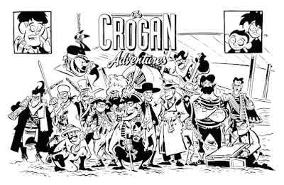
I haven't been taking commissions for a while, because I'd been working on one, and don't cotton much to the idea of taking on new work before the old is delivered - it feels like the artistic equivalent of going into debt.
Anyway, this one had been tricky, compositionally - it's all of the Crogan protagonists, and I finally got it sent off. I liked the final drawing (the logo was drawn, as well) and may use it for something - a print, a coffee mug, I don't know.
First off, thanks to all those who joined the Crogan Adventure Society! With the exception of the handful who got e-mails from me earlier this week, all of your packets have been mailed off and should arrive to you by today (except maybe you Brits - not sure exactly how long it takes first class mail to get out your way).
Back at HeroesCon, Guy Davis was nice enough to pass on a couple of his sketchbooks to me. They were incredible. I quickly started seeking out his work, of which I was already a big admirer, including all the B.P.R.D. trades I could get my mitts on. I generally tend to avoid team books - to me its a rarity when there's a uniformity of artistic vision - but Davis, Acardi, and Stewart have it nailed. These are some of the consistently best comics being made today, full of all sorts of the pulpy stuff I love. It got me keen on the characters pretty quickly, and I did a few sketches of the characters. Here's one, Captain Ben Daimo:
 I've also been re-reading and re-watching my Sherlock Holmes books and movies, mostly as a result of all the brewhaha of the new film. I'm extremely keen to see it, but haven't yet - trying to cut back on expenditures. But here's a pic to keep me in good spirits 'til it gets to redbox:
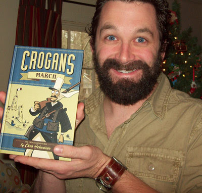
I opened my mailbox today, and guess what I found? The book came out looking really beautiful, thanks to Keith's excellent design and Oni's high production values. Pick it up or order it, if you find yourself so inclined!
Also, though my website's complete overhaul must wait until I'm back at school and thus able to get help with formatting problems that I'm having, the store WILL be up and going January 1st, with one item - something unique and hopefully lots of fun. So check back!
* Edit: Just found out that Oni Press has a few in-house copies immediately available from the website. Not sure whether Amazon's are shipping yet, or if they're on shelves, but if you want one guaranteed to you within the next few days, it's the way to go.
Hey, guys! As part of the Comics Journal's new changing-to-a-web-format launch, a number of the interviews from the 300th issue are being posted for free in their entireity. I mentioned the one that I did with Stan Sakai earlier; now it's up. Read it here.

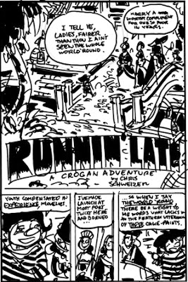
A couple of pencils from the ten-page story I'm doing for the Crogan's Vengeance / Salt Water Taffy Free Comic Book Day comic. This first page was an attempt to try and go back to the style of pencilling I did with Crogan's Vengeance - small fixed-weight pen drawings with spotted blacks. I actually did this about a third smaller than I did with Vengeance, drawing it at about 4" tall. After doing the second page, and realizing that my gutters were actually twice as wide (working this small it was hard to guage) and that I couldn't accurately estimate how big my letters were going to be when I tightened them up, I decided to go back to the NEW way.
Here's the third page:
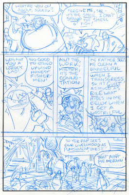 This is the method I used on Crogan's March - a 4" x 6" template in which I used blue pencil. This has a downside - it's hard for me to clearly envision my black-and-white ratio, but the benefits outweigh that. My hope is that I've had enough practice over-analyzing the black/white composition thing and that now a kind of developed instinct will carry me through.
In the final version of this page, the bottom panel has actually grown a little taller to include the top of the pulley-thing, and the row above has gotten shorter - it was only as tall as it was in order to fit in young David Crogan's dialogue in that right-hand panel, and in measuring it out I found that it required less space than I originally thought.
In other news, I found my old J. Peterman "Nantucket Sweater" that I stole from my dad when I first went off to college. He had worn it for years and years before THAT, and for the past couple it had somehow ended up in a storage box. I found it when we were unpacking, and I've worn it pretty much every day since. It's ridiculously comfortable. Peterman clothes last decades; there's not a hole or fray in sight, and I am REALLY hard on clothing. The fact that it survived my undergrad living and a Europe trek is a testament to its stability. So if you're looking for the world's greatest sweater, this one gets my vote, and it pops up in their catalog every few years, so keep your eyes peeled.
Sorry for the slowness in keeping this up - I'd resolved to be more regular, but circumstances threw a kink in my intentions pretty quick. We had a large plumbing problem (really large, necessitating a nine-foot-deep, seventy-foot-long trench to be dug through our yard, which cost us the entirety of what I'm getting as an advance on the new book, and THEN some) that flooded our garage and storage area, meaning that everything was moved into the studio for the week it took to fix everything. Our first major issue with home-ownership, but one that will hopefully negate any major plumbing issues for the next ten years.
Anyway, while I couldn't get much done in the way of work, I DID do a lot of sketches upstairs. Here they are, somewhat annotated: Professor Moriarty, with his rounded back and big head. After I was finished, I realized he looked a lot like Adam Schiff, the old D.A. on Law & Order, though that might be the expression of impatience with Jack McCoy's crazy courtroom antics.
A presumably early design for a character in the fourth Crogan Adventure book. In the post-Arnold age, most strongmen are depicted with strongly defined musculature, but real strongmen (think the guys who pull semi trucks) tend to be just a big mass with a low center of gravity. I like the idea of my big strongman character being somewhat shorter than most of the major characters, just because it's something you rarely if ever see. Another character from the fourth book, the captain of the tramp steamer, as yet unnamed. The ship, not the captain. Though she doesn't have a name yet, either.
Drawing of a character for a Star Wars comic I've been kicking around - who knows if it'll ever see the light of day, but anyway... he's blue.
Anne of Green Gables - one of my wife's favorite book series, and movies. She roped me into watching it a few years ago, and I loved 'em.
Another 4x6" warmup drawing. No story to this one, just a guy on a boat.
Since my work is almost exclusively intended for pure black and white (i.e. no gray), I generally do all of my sketches and for-practice drawings in pure black and white, too. But I've been going over Guy Davis's sketchbooks a lot lately, and love how his gray marker work looks, so I've been toying with them from time to time. This drawing was done a little bigger than usual, about 10" square.
My hands are generally too big for most revolver handles, and I have an unconscious habit of extending my pinkie finger when holding one, as if I were drinking tea or something. So I drew this guy doing that.
Captain Nemo. I think in Mysterious Island he said something about his wife and kid dying in a bombardment by the British, or something - it's been a long time since I read it. I don't remember whether he was on hand or not, but I gave him a few bombardment scars, just in case.
My white ink was still packed and under loads of stuff when I drew this, otherwise I'd have drawn in some bubbles in that window.
Nemo put me on a Victorian Science Fiction kick for the rest of the evening, so I did this guy, some sort of military guy patrolling a British colony on Mars, complete with ray-gun (plus I got to draw another pith helmet)...
...plus this guy, a Martian. I think the Edgar Rice Burroughs martians had four arms and tusks, so here ya go. I dressed him kind of like a 1930s Mongolian with a metal space-vest.
That's it! The plumbing problem is fixed, and the studio is operating at about 65% efficiency (lots of stuff still packed and stacked), but I'm working on a short Crogan's story for free comic book day. I'll post some thumbs sometime over the next couple of days.
Though I try to keep the blog mostly about comics-related stuff, I have been asked by a lot of people to see pictures of Penny, and as I don't have a Facebook or anything like that I've not been able to show her off. So for those who are only here to see new pages, please forgive this foray into personal life... for everyone else, here's little Penelope Schweizer.
Nicole Dabbs (wife of Resurrection and Holiday artist Doug Dabbs) is an EXCELLENT photographer, and came by to do one-week pictures. She's got a bunch on her blog, as well as a slideshow.
She also did a Maternity photo shoot with us a couple of weeks before she took these. So if you've an inclination to see what me, the missus, or the baby looks like, these'll give you an idea.
I've been working on a comission piece for a while, I should have it up in the next few days.
 I found out a couple of days ago that Crogan's Vengeance made the 2010 Maverick Reading List, which is the Texas Library Association's Graphic Novel list - the list is broken into categories of age range (6-8, high school, and adult), and Vengeance is #9 for the middle school category.
This is a big deal to me - not only does Texas have more libraries than any other state in the country (if the knowledge gleamed from my undergraduate library science class is still accurate), but it's also a very well-respected bunch, and to be picked for the list is a real honor to me. Thanks to everyone involved in the selection! I found out a couple of days ago that Crogan's Vengeance made the 2010 Maverick Reading List, which is the Texas Library Association's Graphic Novel list - the list is broken into categories of age range (6-8, high school, and adult), and Vengeance is #9 for the middle school category.
This is a big deal to me - not only does Texas have more libraries than any other state in the country (if the knowledge gleamed from my undergraduate library science class is still accurate), but it's also a very well-respected bunch, and to be picked for the list is a real honor to me. Thanks to everyone involved in the selection!
 The Comics Journal's big 300th issue special is out now (or will be this week), so pick it up! This issue is a collection of interviews - an "established, influential creator" (Art Spiegelman, Dave Gibbons, Jaime Hernandez, David Mazzuchelli, etc) talks with a "rising star" (Matt Fraction, Dash Shaw, Sammy Harkham, Frank Quitely, etc) about the differences in their approach to comics as a result of the generational shifts and advantages.
I was lucky enough to be asked to do a back-and-forth with Stan Sakai, one of my all-time favorite cartoonists. Stan is genuinely one of the nicest, supportive, and patient people that I've ever met, and it was a real pleasure getting to be put in a situation where I could ask a lot of nit-picky questions that I'd otherwise never do. It's a fascinating interview if you're familiar with Stan's work, and if you're not, it's a great place to get a general idea as to what he's all about. Plus, there's some stuff about me, if you're interested. The interview runs for 16 pages, and is found from pages 220-235.
The whole issue is a fascinating read. If you're at all familiar with comics, you'll know that these are some of the most respected folks in the medium, and to get to have these great Hitchcock/Truffaut style segments is a real treat for any comics scholar. You can pick it up at your local comics store, at Barnes and Noble, on Amazon, etc.
Comic Book Resources/Robot 6 has a write up on SCAD-Atlanta's recent Comics Art Forum, with a few quotes from yours truly. Give it a read!
Well, in the space of a week, I finished the book, bought a house, and had a baby. Woof! It's also the last week of classes, so grading is fierce (my scripting class has seventeen students, each of whom is doing a 28-page script), and we're moving this weekend. By Thanksgiving, I expect things will start to level out, but until then I am as swamped with life as I've ever been. Liz and the baby are both doing great.
Here are some sketches I've done over the last few days, mostly in preperation for the fourth Crogan book, which is going to take place in Warlord-Era China - I started playing with gray marker again, something I've not done in quite a while. Some crew designs, including my rough plan for Daniel Crogan's Tramp Steamer captain (top), along with a Fu Manchu type fella in the bottom corner. He'll not be in the book, but all the drawings I've been doing of the Green Gang and other Chinese 1920s stuff gave me a hankering to draw him, too.
Also, here's the rough thumbnail for a larger drawing I hope to do once I'm all moved in and my other art obligations are finished:
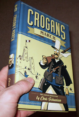
Crogan's March has gone to press! It should be available at select stores at the end of December, and everywhere shortly after (if I'm not mistaken - I often don't know what I'm talking about).
|